Jennifer
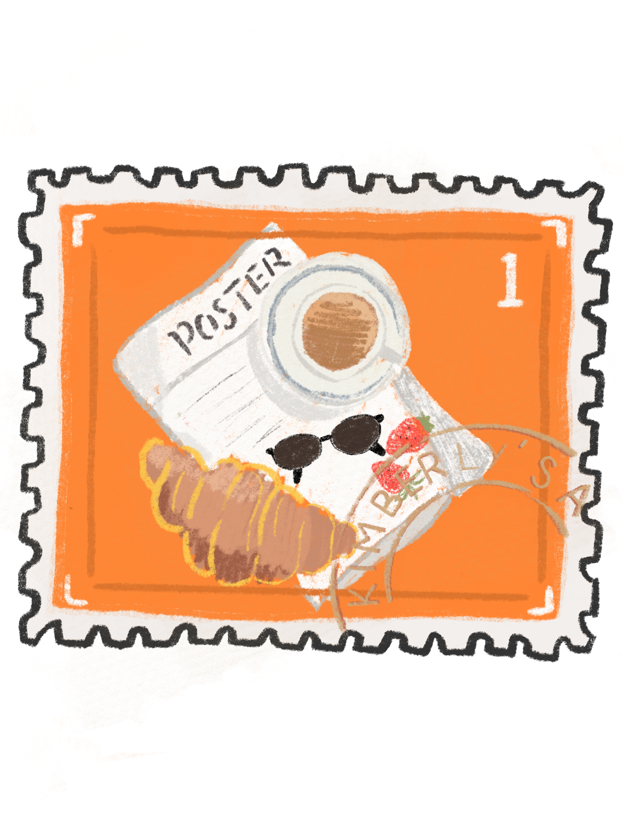
Kimberly


I am a graphic designer and illustrator based in Tangerang, Indonesia. I love butterflies, music, and desserts, and I am in love with color. Since I was a child, I have enjoyed art, spending a lot of time with colored pencils in my sketchbooks.
This love for art led me to study New Media Visual Communication Design at Universitas Bina Nusantara. I am excited to create brand identities and packaging designs that tell a story, aiming to add a unique touch to every project. With my colorful works, I want to bring some joy to a world that can sometimes feel monotonous.


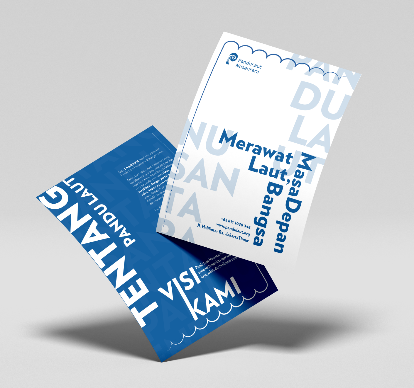
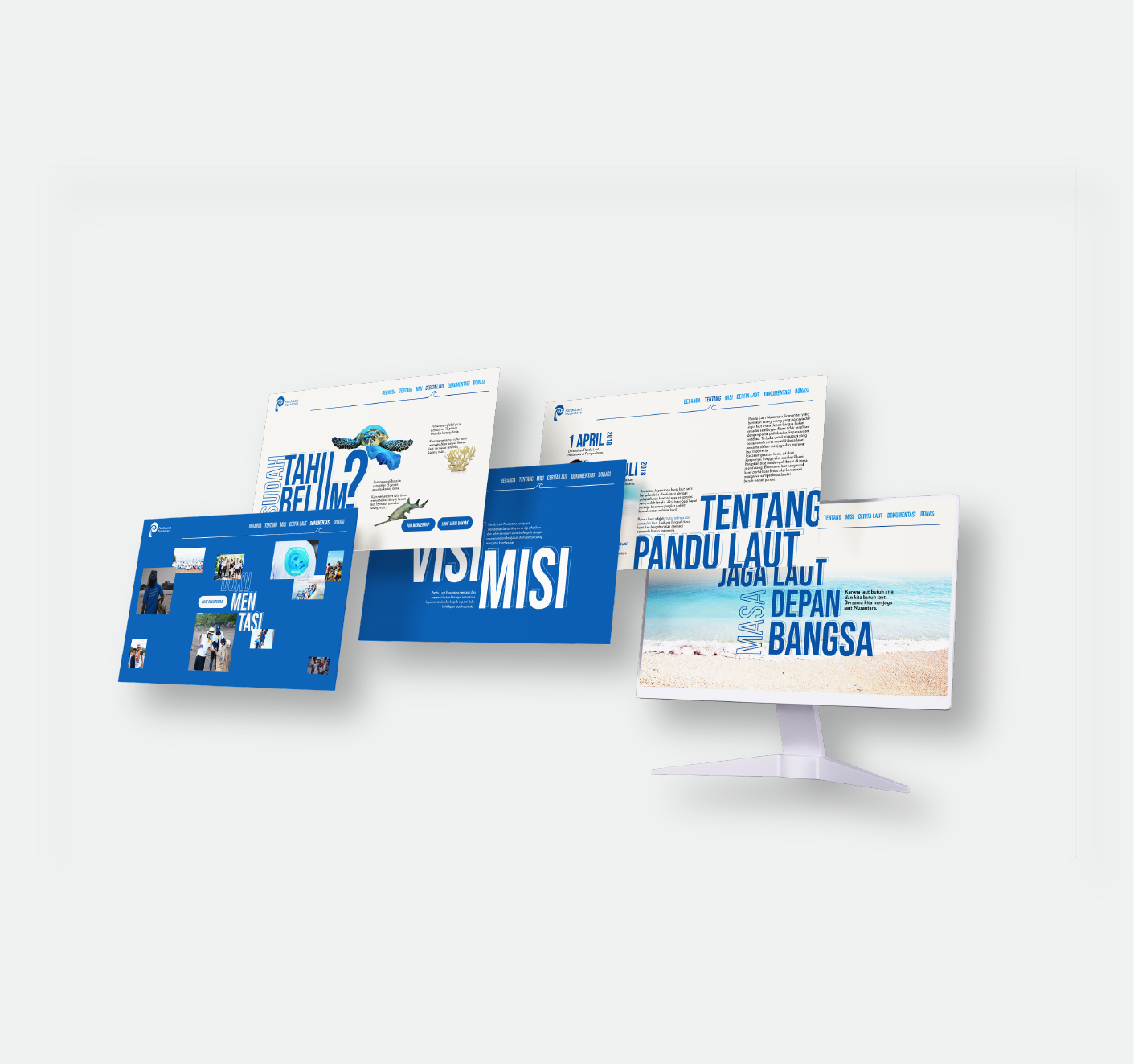
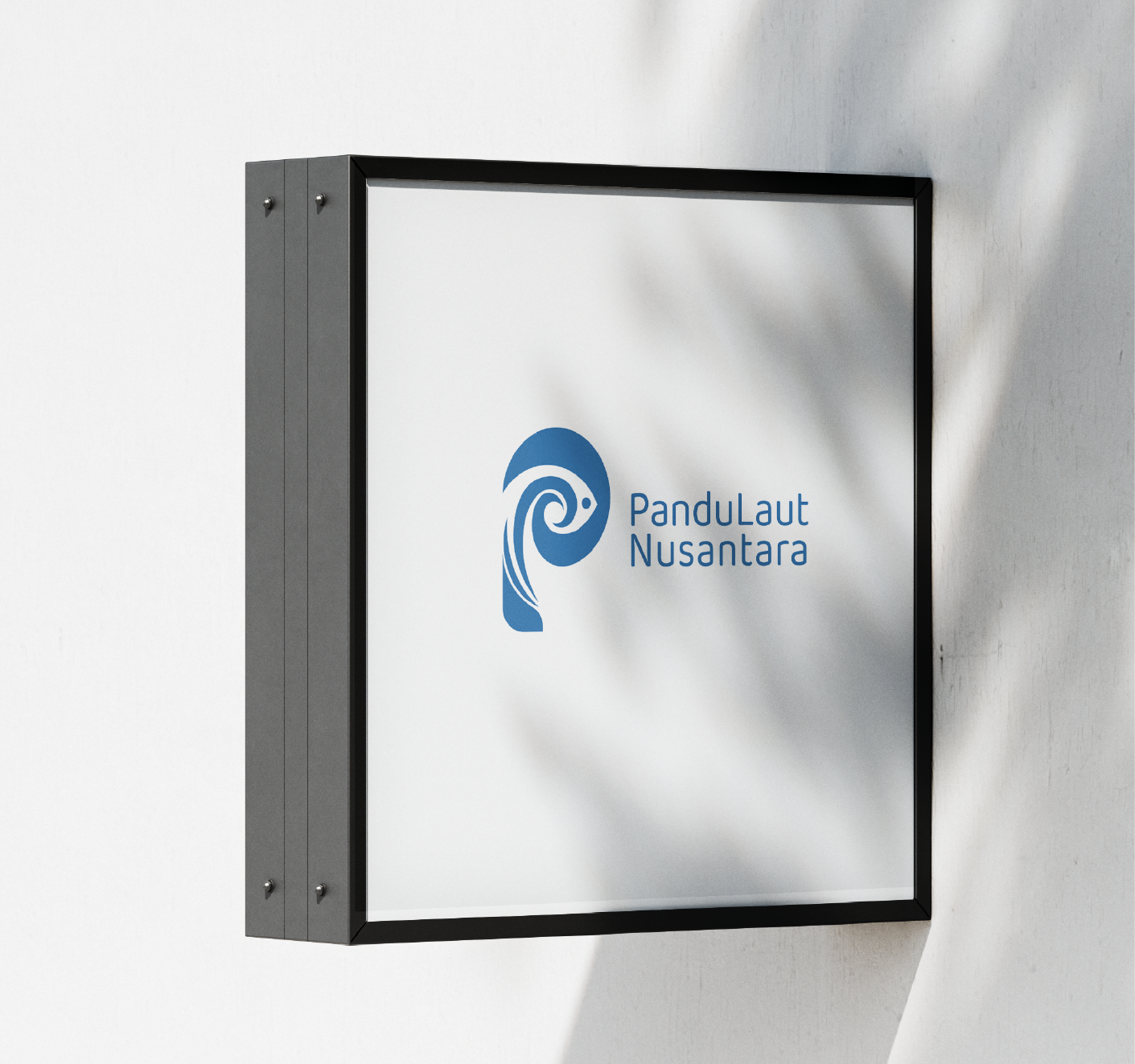
Because "Pandu Laut Nusantara" defines itself as the eyes, ears, and voice of the sea, I have an idea to create a logo that depicts these elements to immediately showcase the identity of Pandu Laut. In this logo concept, I take the initials from the organization's name, which is P, and combine elements of an eye, ear, and waves to symbolize the voice of the sea. Additionally, I include the shape of a fish because 'Pandu Laut' also cares about sea creatures. With this approach, I design a logo that remains simple and easily identifiable across various media contexts, such as print, websites, and merchandise. I also use the color blue to reflect the color of the sea.

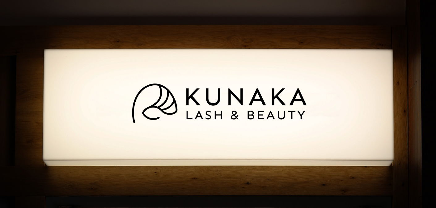
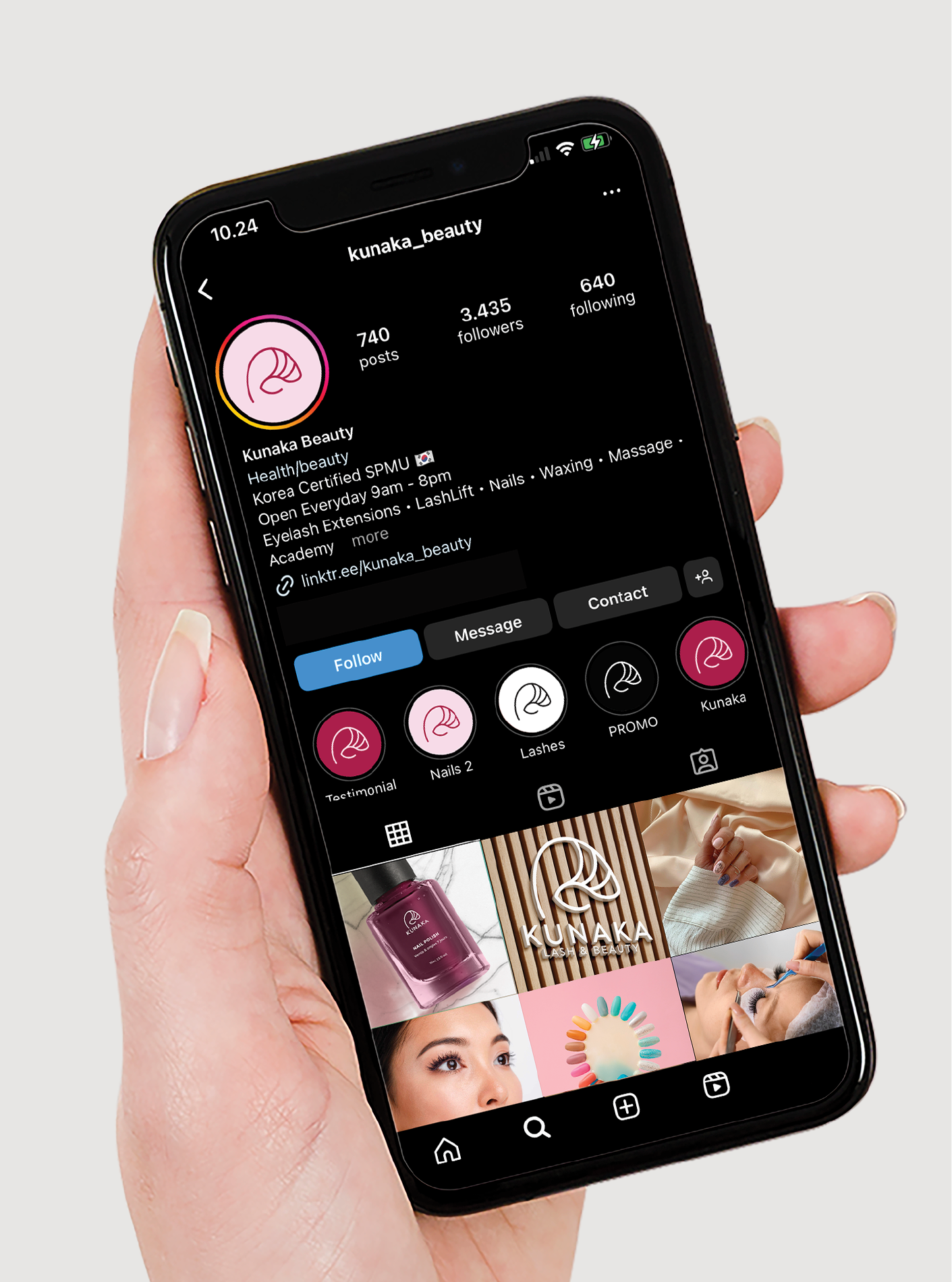
Lash & Beauty
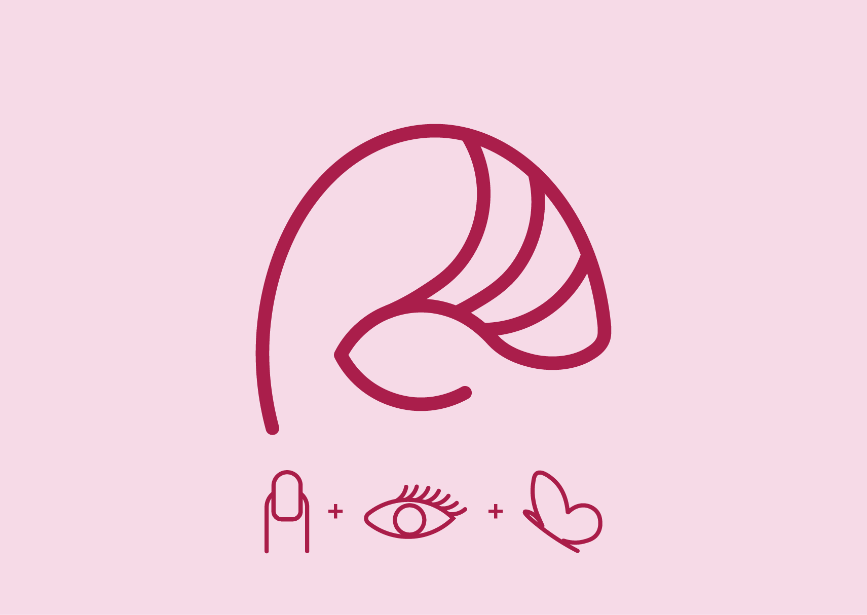
Kunaka's rebranding is designed to align with the evolving market and changing audience preferences. Featuring an elegant and clean visual, the design uses a modern, minimalist yet professional sans-serif font, with elements of nails, eyelashes, and a butterfly symbolizing beauty and transformation. The logo aims to attract a young audience that sees beauty as part of their lifestyle, strengthening Kunaka's position in the competitive beauty industry.
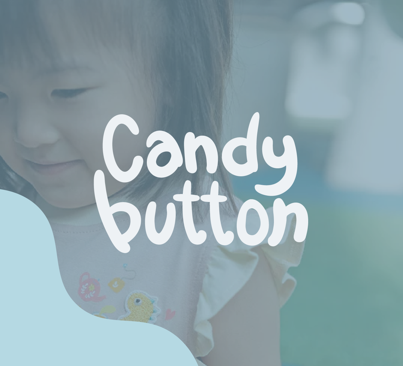
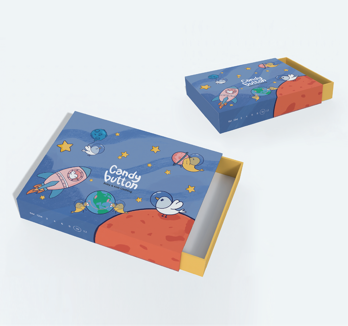
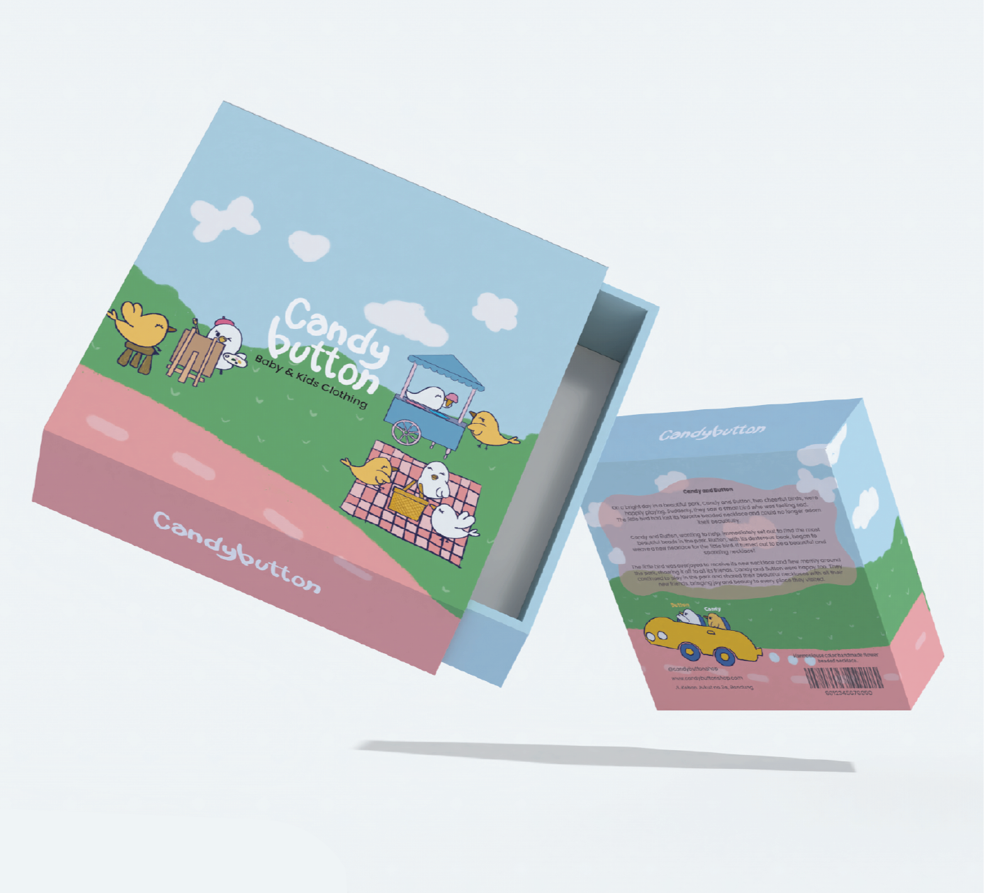
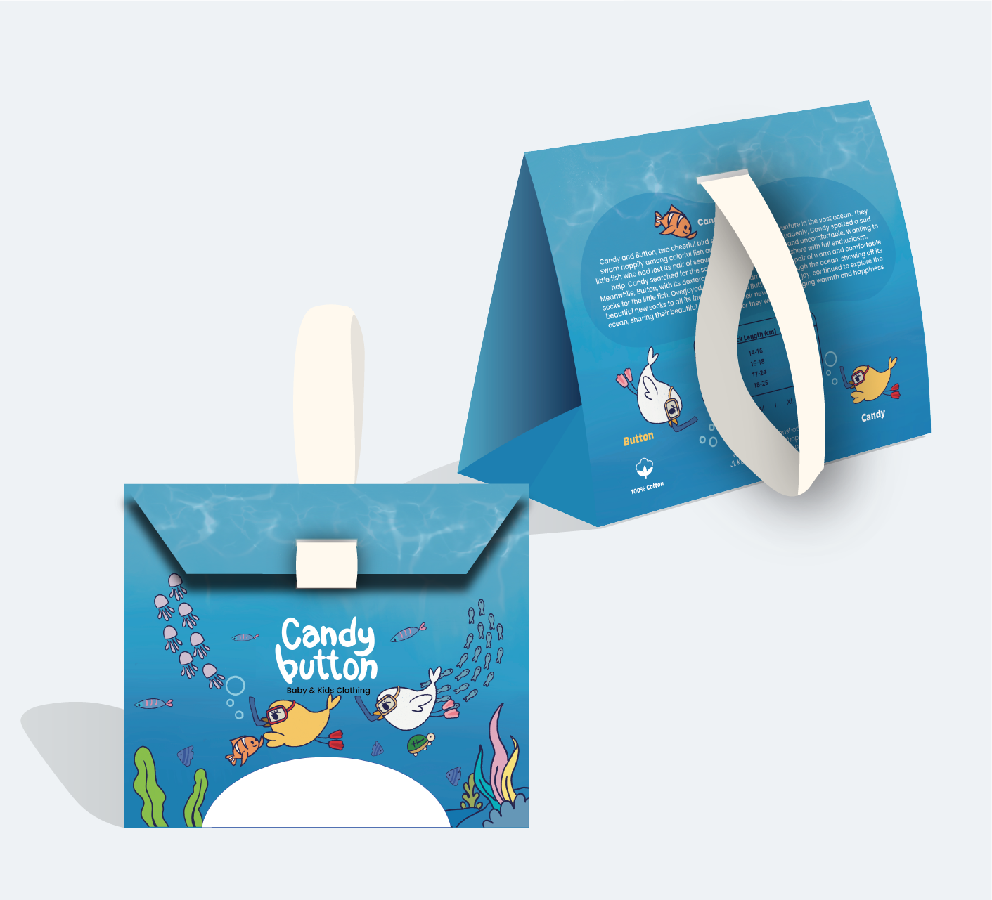
Baby & kids Clothing
Based on research and brainstorming, birds were chosen as the perfect mascot for Candybutton as they embody creativity, expressiveness, and happiness – values that align with the brand's spirit of encouraging children to imagine and create. With a handwritten font for the logotype, the Candybutton logo exudes a handmade feel, strengthening the brand's identity. The packaging is designed using three distinct illustration themes for each product – outer space, the ocean, and the land – to maintain appeal and avoid monotony for children. Each illustration is developed from a perspective inspired by the imaginative and boundless thinking of young children, presenting a fantastical and colourful world that matches the energy and creativity of kids.
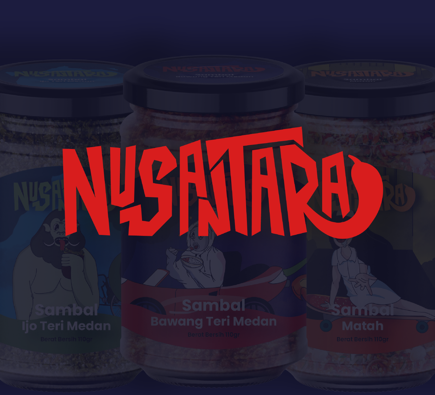
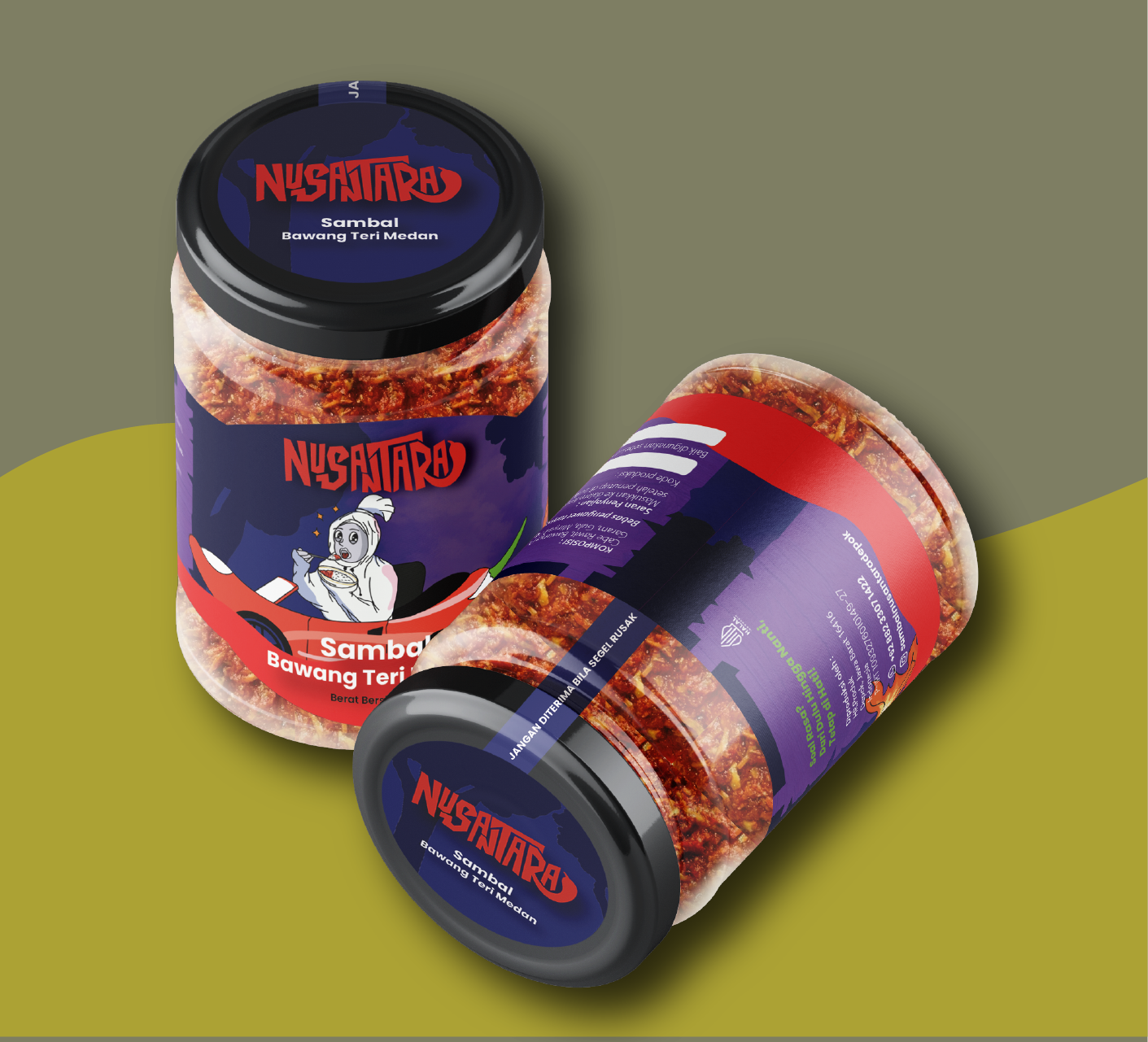
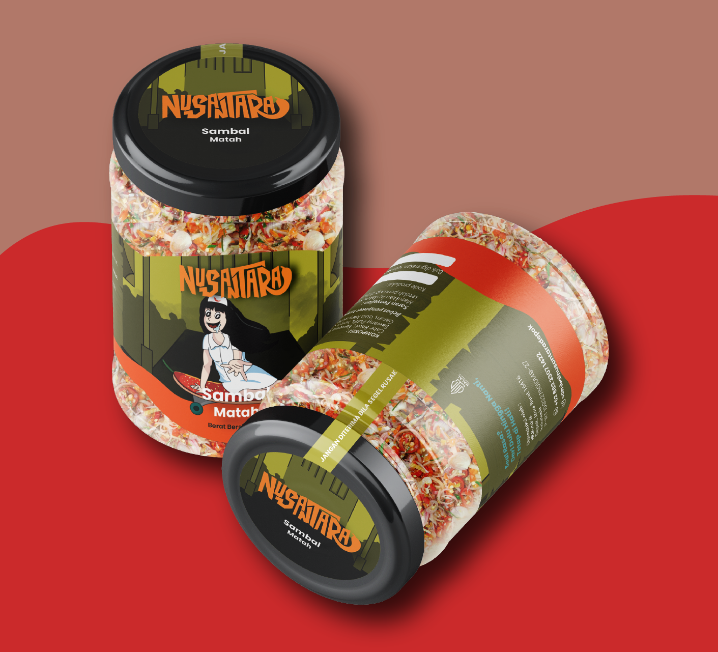
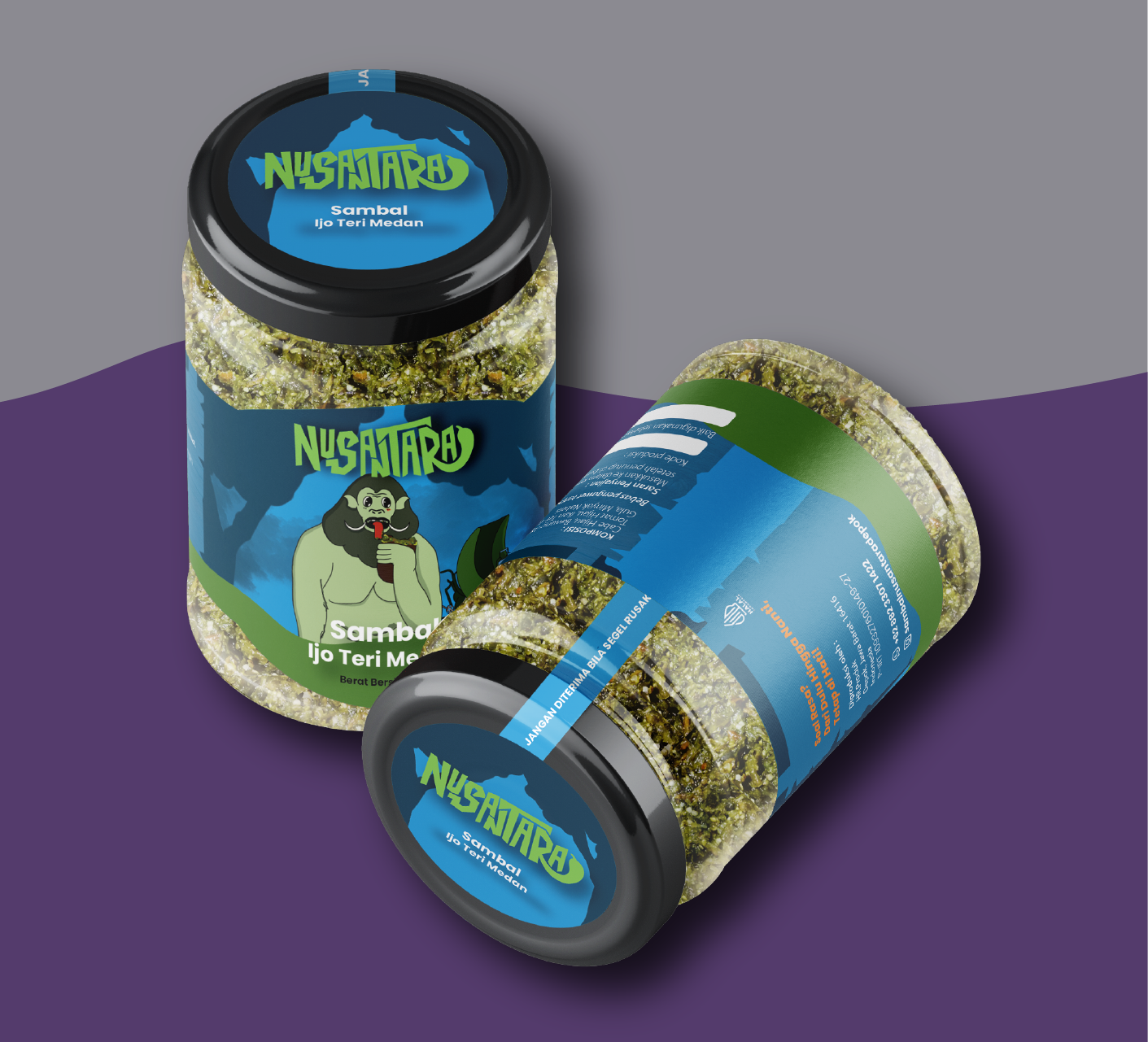
This "Sambal Nusantara" packaging design features illustrations of Indonesian ghosts, such as pocong, suster ngesot, and genderuwo, with cute and adorable expressions. Inspired by the surprising reaction of eating spicy sambal, this packaging combines the sensation of being "surprised" with the presence of ghosts, creating a unique and entertaining connotation. With strong local cultural elements, this packaging is expected to attract consumers and provide a pleasant visual experience that is close to the Nusantara identity.
PLEASE STAMP HERE


You can place the stamp anywhere you want.